

We heard you! When we reviewed our content survey results, one message came through clearly: there’s a growing need for more focus on accessibility. And you’re right—accessibility affects everyone! In the coming months, we will be sharing more stories that highlight why accessibility truly matters at UC.
Note: This is part one of a two-part series by Brian McNeilly. Look for part two coming soon: Accessibility Best Practices
With the ADA Title II rules soon coming into force, it’s a good time to refresh some accessibility skills and think about best practices around accessibility. Below are the top five accessibility issues that we encounter around digital accessibility.
1. Untagged PDFs
PDFs are everywhere, but many people don’t realize that in order to be made accessible, PDFs require something called “tags.” Without these, screen readers and other assistive technologies will not know which content to read in what order and can’t determine if text is a heading or a list.
Thankfully, most software can automatically apply headings when you export from your source format (e.g., Microsoft Word, Google Docs, etc.) into PDF. However, not all applications will automatically export these tags for you. If you are unsure if your document has been tagged, you can always run an accessibility check in Adobe Acrobat or check resources on how to export PDF documents from your source application.
2. Images without Alt Text
Much like how PDFs need tags to be accessible, images require alternative text (often shortened to “alt text.” Without alt text, screen reader users will have no description of what an image is and may just be presented with the file name (e.g., “same_image_15.png”), which will never create as much context as well authored alt text.
Alt text should be a brief description (typically no more than 120 characters) of what a picture is and convey what the function of the image is. Screen readers will announce to users that they’re looking at an image, so within your alt text there’s no need to use words like “image of…” or “photograph of…” in your alt text.
Just like we can use the same image in different contexts and the image’s meaning will change, alt text should match the context an image is being presented in. An image of a bee in a biology class may be focused on the anatomy of the insect, while that same image in an ecology class may be more focused on interactions with plants.

In the event that you have an image that is purely decorative (i.e., it’s used entirely for decorative purposes and adds no meaning to the document), there is a method to tell screen readers to ignore the image. This can be referred to as setting either “marking an image as decorative” or “null alt text.”
While automated checkers tend to be very good at checking if an image has alt text, they are not great at determining if alt text is accurate. Similarly, while many tools are available to use AI to automatically generate alt text, these captions at present tend to be overly verbose, describing every possible thing an image could be implying, as the computer does not know what the intention of a specific image is.
3. Missing Headings and Skipped Heading Levels
Whenever we organize content in a document, like this blog post, we typically break content into sections. This aids everyone in understanding the structure of the document and allows for quick scanning of sections of interest. Visually, these sections are often introduced with a heading (e.g., “3. Missing headings & skipped heading levels” above) to allow sighted users to skim the document visually for interesting content.
In structuring a document with headings, there is usually some sort of order – in this document, the title is the first heading, with a section for “Top 5 Most Common Accessibility Issues” and underneath that, individual headings for each common issue. We can think of these levels sort of like an outline or list:
- Top 5 Most Common Accessibility Issues
- 1. Untagged PDFs
- 2. Images without Alt Text
- 3. Missing Headings and Skipped Heading Levels
- Etc.
Visually, this hierarchy is conveyed by the headings getting smaller and closer to the body text size. If we use the right structure, blind users using screen readers can receive this same information, with a list of headings being presented in a nested fashion like our outline above. After reviewing the list, users can then jump directly to a given heading & read the content beneath it.
If we don’t use proper heading markup, and just make our text big and bold, a screen reader will not get access to any headings in our document at all, making it much more difficult to read content and navigate the page. You can implement heading tags in HTML or if you’re authoring a document there are heading styles in MS Word and Google Docs headings.
Just like we don’t want to skip headings, it’s important to make sure that we only apply headings to content that are structurally headings in our document. Do you want to emphasize text, but it doesn’t label any content beneath it? It’s probably not a heading.
Similarly, when we do use headings, we want to make sure they’re at the appropriate level. Using our example above, if all of our headings were on the same level, we would quickly lose the structure of our document, even though everything is marked as a heading:
- Top 5 Most Common Accessibility Issues
- 1. Untagged PDFs
- 2. Images without Alt Text
- 3. Skipped Heading Levels
- Etc.
Finally, it’s important that we don’t skip heading levels within our documents. Just like having a “flat” set of headings like the list above, going from the top level of a list to two layers down would look strange and make it unclear on what the meaning of the structure is.
4. Insufficient Color Contrast
Most people would intuitively understand that putting very light grey text on a white background would make text “invisible” and therefore unreadable. But, beyond situations like this, many people don’t think much about color contrast.
For many users with low vision, when colors are too similar (i.e., light text on a light background or dark text on a dark background), text can be impossible to read. This may be the case even if to other people’s eyes the text is perfectly legible.
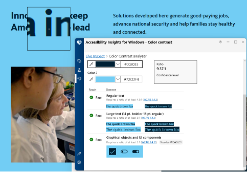
In order to provide a testable metric for how much contrast two colors have, the WCAG uses a contrast ratio, measuring the relative luminance of two colors. A ratio of 1:1 would be a case where the two colors are exactly the same, such as white text on a white background. The maximum ratio you can have in this system is 21:1 and is attained when using white and black. Contrast ratios in this system are the same regardless of if a color is the text color or the background color, so black text on a white background has a contrast ratio of 21:1, and so does white text on a black background.
WCAG also identifies a difference between “large text” and “normal” or “regular sized” text. Text that is sufficiently large can have a slightly lower contrast ratio as it is big enough to still be read by most users. For normal sized text, we should aim for a contrast ratio of at least 4.5:1, while large text should be at least 3.0:1.
The easiest method to test for color contrast is to use an automated tool. Online color contrast checkers, as are desktop tools like the Colour Contrast Analyser and Accessibility Insights for Windows. While both work and will present the same results, some of the desktop tools will allow you to use a dropper tool to select colors, while most online tools require you to paste in color values as hex codes.
Alternatively, many UC locations have devised color contrast guides for their brand colors. For the systemwide colors, the UC Brand Accessible Color Guide provides a list of color combinations that are both brand and color contrast compliant! If your location has a dedicated brand section, you may want to investigate that for additional resources specific to your location.
5. Not Adding Descriptive Link Text
Click here! Learn More! This! Each of these are commonly used as text for links on web pages, in emails, and throughout documents. While this text makes it clear that the item being clicked is a link, it makes it difficult to tell where someone will be going when they click the link.
Links with descriptive text, like the “read the new IT Accessibility Policy” or “What is WCAG 2.1?,” quickly make it clear what a user will be reading and getting access to, even when taken out of context of the sentence they’re contained in.
This ensures sighted users scanning a page can quickly tell what they’ll be going to when they see the familiar underline of a link. Similarly to the discussion on headings above, screen readers can also pull up a list of all the links on a page. When links have unique names it’s easy to tell which one you may want to click on. But, if a page is filled with a dozen “Click here” links, that list is much harder to navigate.
Conclusion
While this post doesn’t cover every possible accessibility issue you may encounter, armed with the tool to fix these five issues, you should have documents that are significantly more accessible. As always, if you have questions, you can reach out to an accessibility subject matter expert at your location or visit the following accessibility resources:
Author

Brian McNeilly
Web Accessibility Specialist
UC Office of the President