By Judy Thai. In November 2018, over 217,000 high school and transfer students submitted undergraduate applications to the University of California. 75,000 of them submitted their applications on the last day — and 11,000 in the last hour.
That’s a lot of activity!
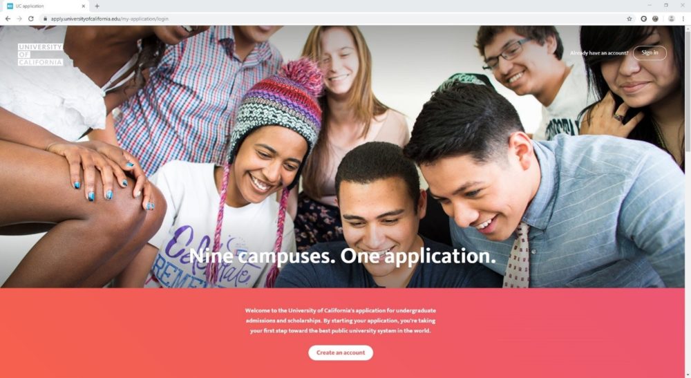
“ApplyUC” is the name of the online web application that students use to apply for admission to the University of California’s nine undergraduate campuses: Berkeley, Davis, Irvine, UCLA, Merced, Riverside, San Diego, Santa Barbara, and Santa Cruz.
To prepare for the November 2019 onslaught of submissions, the UC Office of the President (UCOP) launched a redesigned applyUC application on July 1 of this year. The new applyUC, which vastly improved the student user experience, is the result of a strong collaboration among student affairs, IT, and communications.
Beyond the Paper Form
Back in November 2010, when the previous iteration of applyUC went live, the goal was simply to replicate the paper application form in an online version. At the time, the UC didn’t have a systemwide brand, and UCOP didn’t have a user experience designer, so those weren’t big considerations.
The system worked well and processed growing numbers of applicants every year. But as websites became increasingly interactive and intuitive, we realized applyUC needed to be reimagined – with a focus on the user experience, including accessibility for people with disabilities.
We started the reimagining in 2015 by asking high school and transfer students to describe their experience using the system. We also interviewed students who had filled out an application, but didn’t submit it, so we could understand what held them back.
My Future in a Click
The biggest revelation was that students were extremely stressed by the entire application process. One student said, “It’s my future in this one click.” Students weren’t finding the information that they were expecting, they made unpredictable choices when they didn’t know how UC would use their answers, and they couldn’t find their desired majors because they didn’t understand how each campus is organized.
Thus, putting students at ease became the main goal for the redesign. We wanted it to be just as easy for first-generation, low-income, disabled, or non-native English-speaking students to complete the application, as it is for students whose parents or siblings know the ropes and can help them.
It Takes a Village
A strong collaboration between the Student Affairs, External Relations & Communications, and Information Technology Services (ITS) departments at UCOP drove the applyUC redesign process.
Student Affairs is the authority on applicants and the UC admissions process, and has the expertise in student needs. Hence, they provided the requirements and outlined some of the situations that have come up during the admissions cycle.
They ensured that UC is in compliance with student admissions standards and guidelines, such as when the General Data Protection Regulation (GDPR) regulation was announced during the redesign process. They also verified that the redesigned application maintained the integrity of the student data so that campus admissions officers have the data they need to make admissions decisions.
External Relations & Communications ensured that the design adhered to the UC brand. They pushed for intuitive interactions within the application, and provided content that had a friendly, conversational tone. The logic was simple: If students were less stressed, they could provide better data, enabling UC to make more informed admission decisions.
ITS worked to ensure the redesigned application was coded well, was secure, and was properly tested. They also adhered to the UC brand and design mock-ups. They also load-tested the system to make sure it could handle the huge influx of students who log-in during the last few days of the application period.
ITS tested and coded for accessibility throughout the development process, enlisting the help of a blind accessibility consultant. Happily, he wrote in his report that “applyUC is an example of an accessible and efficient application process.”
Working together, we were able to launch the completely redesigned applyUC on July 1, 2019, to accept applications for the Winter 2020 academic term.
Our three departments are proud that the new interface is more user-friendly, intuitive, and accessible. Maybe now, with one click, we make a UC education more attainable to a diverse array of students. Who knows – we also may beat the record this year for the most applications submitted in the last hour of the last day!
 Judy Thai is manager of application engineering, Information Technology Services, UC Office of the President.


