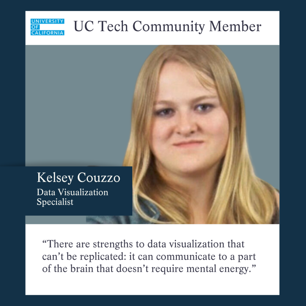
By Derek Shue. Kelsey Couzzo, a data visualization specialist, spoke with the UC Tech News team about her journey spearheading accessibility education and implementation at UCSF. In an era driven by data, dashboards are a valuable tool to quickly communicate and provide information that decision-makers need. Couzzo reviews emerging techniques to address the challenges of making these dashboards both more effective and accessible.
Watch this segment of the interview on Couzzo’s work creating visualization that is accessible, even to those who cannot see.
The interview, below, is based on a recorded interview with Kelsey Couzzo, conducted by Laurel Skurko.
Couzzo’s career journey before and after UCSF
What drives Couzzo’s work in data visualization and accessibility
Couzzo’s passion for data lies in uncovering truths within data and communicating them effectively, aiding organizations in making data-driven decisions to enhance outcomes for all. For her, data is a tool to uncover “truths about humanity and unexpected answers,” and data visualization is a way to tell a story to people who may not necessarily understand the science behind the research. Instead of being forced to analyze and interpret numbers, data visualization creates a story that can be easily understood.
“There are strengths to data visualization that can’t be replicated: it can communicate to a part of the brain that doesn’t require mental energy (to gain insights and understanding).”
KELSEY COUZZO, DATA VISUALIZATION SPECIALIST
Couzzo’s career timeline
The following timeline demonstrates the progression in Couzzo’s career, from the arts to data visualization, and how she integrated accessibility to strengthen her repertoire. In 2023,
- 2011: Couzzo earned a bachelor’s in media arts and Animation in 2011, she started her career as a digital artist at CustomInk.
- 2018: Couzzo leads data visualization efforts at the University of Virginia School of Medicine.
- 2021: Couzzo completed a Data Science Fellowship. Among her projects is the creation of a tool aiding individuals with accessibility needs in discovering cities tailored to their requirements.
- 2022: Couzzo took on the role of a senior Tableau developer at UCSF.
- 2023: Couzzo is currently serving as a senior software engineer for analytics and data visualization at Quantivity.
The Digital Accessibility Advisory Committee (DAAC) at UCSF
Joining the Digital Accessibility Advisory Committee (DAAC) at UCSF in May 2022, Couzzo advocated for the creation of accessible dashboards after presenting her insights to a group of data visualization specialists at UCSF. Since then, Couzzo’s team at Enterprise Information & Analytics (EIA) at UCSF worked towards making new dashboards consider colorblind accessibility from inception. This accessible approach is setting a new standard for dashboard development at UCSF.
The DAAC plays a pivotal role in fostering awareness and implementation of accessibility standards. Meeting monthly, the committee evaluates components of the university’s digital presence, including websites and PDFs. Couzzo and Jill Wolters, digital accessibility program manager at UCSF, both members of the DAAC, presented at the 2023 UC Tech Conference, offering insights on how to create teams and manage inclusively. To learn more, watch their presentation, “Supporting Inclusive Teams,” from the 2023 UC Tech conference.
A personal connection to the challenges of data visualization accessibility
As a person who uses a wheelchair and occasionally requires a screen reader, Couzzo is a passionate advocate for accessibility in data visualization. While accessibility of dashboards can be a challenge because dashboards are a visual medium, they do not have to be inaccessible for seeing-impaired populations. There are solutions.
An example Kelsey cites is that the most common cause of reduced accessibility is color choices. For instance, the use of red and green to signal “bad and good” can be problematic for the approximately 8% of men who are colorblind.
Solutions: recommendations & resources for accessible dashboard design
Couzzo provides the following recommendations to those interested in ensuring their data visualization dashboards are accessible to all.
- Use sharp contrast and accessible colors to make dashboards discernable for colorblind and visually impaired users. To this end, Couzzo recommends Color Oracle simulating color blindness and ensuring compatibility. Using appropriate colors of shades of gray and choosing colors that maintain their contrast when viewed by a person with color blindness can mitigate the problem.
- Verify the screen reading capabilities of dashboards. Since dashboards need to incorporate accessibility features such as screen readers or individuals with visual impairments, alternative approaches such as sonification (using sound for communication) are currently being explored
- Use alt text and descriptive labels on photos and data diagrams.
- Design dashboards that can be navigated efficiently using a keyboard alone (vs a mouse).
- Choose fonts that are legible and resizable without loss of clarity. Arial, Helvetica, Tahoma, Verdana, Times New Roman, and Century Gothic are suggested as accessible fonts. Designers may notice all of these fonts are sans-serif. The text should be at least 12pt in size to be accessible.
- Organize dashboard content logically and consistently; using proper heading hierarchy (as was used in this article – an outline structure) and layout structures, which aid screen readers in conveying information coherently.
- Strive for simplicity in design to reduce cognitive load.
An Open Invitation
Although Couzzo is not currently employed at the University of California, she is still a member of the UC Tech community because she supports advances in technology at the university through her participation in workshops, webinars, and networking events. She welcomes connecting with UC colleagues any time and looks forward to sharing more information about her work and learning more about you. To connect, please contact her through email at KelseyCouzzo@gmail.com.
Contact
Kelsey Couzzo
Senior Software Engineer – Analytics and Data Visualization, Quantively
Former Senior Tableau Developer, UCSF
Email: KelseyCouzzo@gmail.com

Digital Accessibility Program Manager
UCSF
Author
Derek Shue
Marketing and communications intern
UC Office of the President


