By Greg Boyer. “Make your data make an impact.” That is the promise of Tableau, a market-leading tool for transforming your data into head-turning visualizations.
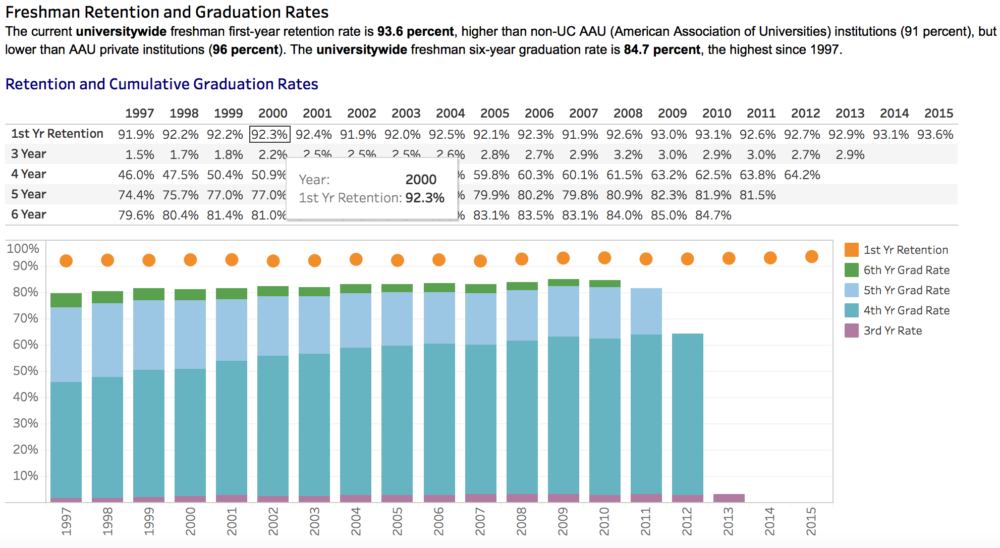
No matter our role, every day we interact with databases, Excel files, and various reports that contain critical data that we need to find some way of communicating to our customers and colleagues. Tableau fills this visualization gap by allowing you to create dashboards and visualizations directly on your desktop through a lean, simple interface. It allows you, the business expert, to communicate your data in precisely the way you need, as with the graph above of freshmen retention and graduation rates, produced by the UC Information Center.
But in the fast-moving world of data and visualizations, and with a constantly evolving toolset and ever new challenges, how do you find the support you need to answer questions, see new best practices, and find innovative ideas?
The UC Tableau User Group can help.
Meeting on the 2nd Friday of every month at UCOP and remotely via Zoom, the UC Tableau User Group is a gathering of report developers, IT personnel, researchers, and anyone who feels their work could be supported by better visual communication.
With a wide-range of contributors from across the system and in a variety of departments, you’ll see presentations from UCOP Institutional Research, UC Berkeley, UC San Diego, UCOP Procurement, and other contributors. You’ll be exposed to new features, best practices, finished and in-progress reports, and a variety of presentations. And best of all, you’ll find a welcoming community eager to grow, support, and develop our skills together.
So if you’re a dedicated Tableau expert, or brand new to the idea and are interested in how Tableau might improve your work, stop on by.
More information about the UC Tableau User Group and how to join it is available online.
Greg Boyer is a business intelligence lead in Information Technology Services, UC Office of the President.


